How to pick a decorative font that actually fits your photo
A practical framework for matching typeface mood to imagery — contrast, weight, era and the one mistake everyone makes.
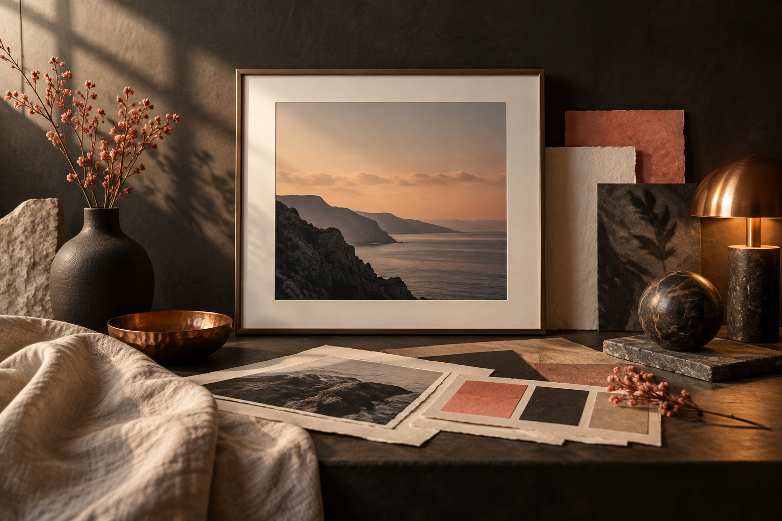
Start with the image, not the font menu. Ask what the finished piece needs to do: sell a product, announce an event, set a mood or simply make someone stop scrolling. The typeface should reinforce that job before it adds personality.
First, name the image's dominant feeling in one or two words — quiet, playful, raw, nostalgic or polished. Then look for a typeface with the same energy. A soft handwritten face can humanise a still life; a sharp display face can give a fashion image more tension. When the image and the lettering speak in different emotional registers, the design feels accidental.
Use contrast deliberately. If the photograph is busy, choose a simpler silhouette and give it room. If the image is calm and spacious, a more expressive face can become the focal point. Contrast in weight, width and colour is useful; contrast in every dimension at once is usually noise.
Check the type at the size people will actually see. Zooming in on a desktop hides problems that become obvious on a phone: counters close up, thin strokes disappear and long words lose their rhythm. Test the real headline, not a sample alphabet, and compare two or three candidates side by side.
Finally, tune the relationship rather than decorating around a mismatch. Adjust tracking, line breaks, colour and placement before adding effects. If the lettering still feels pasted on, the answer is often a different typeface — not another shadow. Letterlays Studio lets you test that decision quickly with your own words and image.
A useful rule of thumb: choose the font that makes the photograph feel more intentional, then remove one effect. Restraint leaves the image visible and gives the lettering a job it can actually perform.