Make type work for your design.
Practical guidance for choosing, composing and licensing expressive lettering.
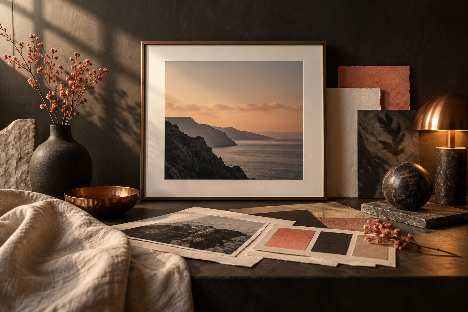
How to pick a decorative font that actually fits your photo
A practical framework for matching typeface mood to imagery — contrast, weight, era and the one mistake everyone makes.
Read article →
Layering letter overlays for a natural light look
Blend modes, opacity and placement — how to make a letter overlay feel lit by the scene instead of pasted on top.
Read article →
Free vs premium fonts: what a licence really covers
Personal, commercial and embedding use explained in plain language, so you can choose the right Letterlays licence for the job.
Read article →
12 lettering directions to explore in 2026
A visual prompt list for choosing a direction — from quiet editorial serifs to raw street marks — without chasing a single trend.
Read article →
Twelve type categories, and when to reach for each
Groovy, gothic, monoline or molten — a map of the catalogue and the jobs each style does best.
Read article →
Export settings for print, web and social
A practical resolution, colour and format checklist so your lettered images stay sharp wherever they appear.
Read article →