
Choosing a decorative display font for posters, branding and packaging
Which style serves your project best — rough street energy, elegant serif contrast or retro geometric charm? A category guide with real Letterlays examples.
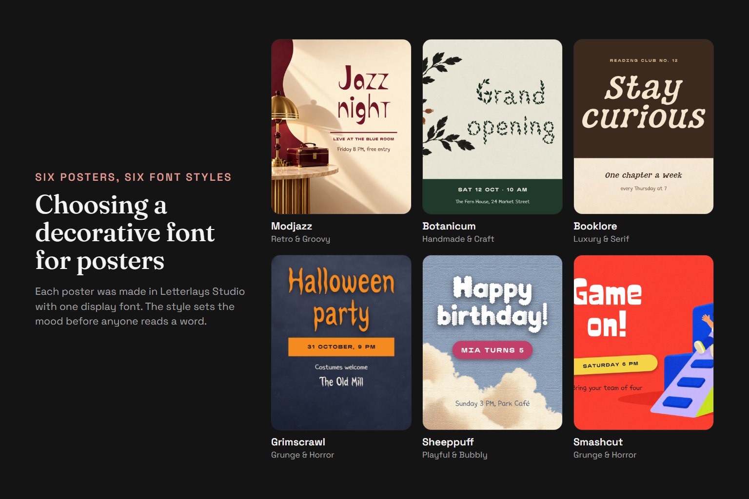
Start with the project's emotional register and audience, not the style name. A concert poster for an underground electronic act and a wedding stationery suite both need display typography, but they ask for completely different voices. Define the feeling first — energetic, restrained, warm, edgy, nostalgic, surreal — then look for typeface categories that speak in that register. Letterlays organises its 108 decorative fonts into 12 style families to make this search faster.
For posters and event graphics where the type needs to command attention and work at a distance: Brush & Paint (visible gesture, organic edges, festival and music contexts), Urban & Street (compressed energy, graffiti roots, nightlife and youth culture), Grunge & Horror (texture and tension, genre film posters, alternative bands). These categories give headlines enough personality to carry a simple layout. Pair them with restrained body type — the display face does the expressive work, and the supporting text steps back.
For brand identity and logo design where the typeface must remain legible across scales and hold its shape in single-colour reproduction: Geometric & Bold (clean construction, strong silhouette, works in thumbnails and signage), Luxury & Serif (high contrast, editorial refinement, premium positioning), Retro & Groovy (rounded rhythm, period character, brands with heritage or craft narratives). Test the logo at favicon size (16×16 pixels) and on a large banner — if fine details disappear or counters close up at small sizes, choose a sturdier option.
For product packaging and label design where the type lives among other visual elements and must not overwhelm the product itself: Handmade & Craft (tactile warmth, artisan positioning, food and home goods), Script & Handwritten (personal touch, boutique appeal, gifting and stationery), Mystic & Fantasy (ornamental detail, special editions, storytelling brands). Packaging often shows the typeface in short bursts — the product name, a tagline, ingredient highlights — so character coverage matters less than the first impression of three to five words.
Avoid common mismatches: Playful & Bubbly faces can make a serious service feel untrustworthy. Grunge & Horror fonts are difficult to read in small sizes and alienate general audiences. Mystic & Fantasy ornament works for world-building brands but reads as kitsch when the product has no narrative context. Liquid & Psychedelic and Monoline & Minimal serve niche aesthetics — powerful when the match is right, but they do not suit broad commercial use. If you are uncertain, test the type with the actual project content in Letterlays Studio before purchasing.
Category comparison table:
| Category | Typical Use | Mood / Voice | Example Fonts |
|---|---|---|---|
| Brush & Paint | Posters, album covers, bold headlines | Gestural, energetic, raw | Dry Brush, Paint Marker, Flowmarker |
| Urban & Street | Music graphics, streetwear, nightlife | Compressed, edgy, youth culture | Graffiti Tagline, Urban Scratch, Spray Paint |
| Grunge & Horror | Alternative posters, Halloween, texture | Tension, decay, genre-specific | Creepy Scratches, Beast Scratch, Grimscrawl |
| Geometric & Bold | Logos, signage, tech brands | Clean, strong, modern | Polyblock, Bloblox, Gigaform |
| Luxury & Serif | Premium brands, editorial, awards | Refined, high contrast, prestige | Eternal Gold, Booklore, Sharp Gothic |
| Retro & Groovy | Heritage brands, vinyl reissues, craft | Rounded, nostalgic, friendly | Funky Groove, Mellownote, Velvet Swash |
| Handmade & Craft | Artisan products, food, home goods | Tactile, warm, human-made | Chalk Craft, Paper Hugs, Stitchy |
| Script & Handwritten | Invitations, boutique, personal brands | Elegant, casual, personal | Delicate Line, Unveiled Diary, Valentineline |
| Mystic & Fantasy | Fantasy games, special editions, storytelling | Ornamental, atmospheric | Arcane Sigil, Spellwirl, Inkadelic |
| Playful & Bubbly | Kids' products, casual apps, fun events | Friendly, soft, approachable | Blobbie, Happy Wiggle, Glooply |
| Liquid & Psychedelic | Surreal brands, experimental posters | Fluid, inflated, trippy | Liquid, Melted Plasma, Fluidia |
| Monoline & Minimal | Tech, architecture, quiet branding | Restrained, single-weight, neutral | Linehaven, Geomark, Znamya |
Selection workflow: Visit letterlays.com/fonts and filter by the category closest to your project's mood. Open three to five candidates that feel directionally correct. For each, use Letterlays Studio to test your actual headline or brand name on a representative background — not generic placeholder text, but the real words your audience will see. Export all three versions at the size and format you will use (e.g. 1080×1080 for Instagram, 2480×3508 for an A4 poster, or a realistic web-page mockup). Compare them in the final context, not in the browser preview. The right choice usually becomes obvious when you see it at working scale.
Pricing context: Most Letterlays fonts cost $12 for Desktop / Creator (unlimited projects, client work, merchandise as rasterised designs) or $29 for Webfont (desktop rights plus website embedding on one domain, up to 100k pageviews per month). One licence covers unlimited projects in that use category — you do not buy separately for each poster or logo. If a project needs both print branding and website embedding, the Webfont licence includes both. Business ($49) bundles Desktop, Webfont and E-publishing for small companies using one typeface across collateral, their site and a digital catalog.
Do not choose a typeface because it is fashionable in design showcases or trending on font directories. Choose it because it makes your specific project's message clearer, your brand's voice more consistent, or your poster's emotional impact stronger. The font is a tool, not the design itself. Test it with the real content, in the real context, at the real size. If it does not improve the work, keep looking.
Frequently asked questions
How many fonts can I try before deciding?
All 108 typefaces in Letterlays Studio, instantly and for free. Filter by category, test your actual project text on your own image, and export high-resolution previews to compare options.
Do I need a separate licence for each project?
No. One Desktop / Creator licence ($12) covers unlimited projects — posters, logos, packaging, client work. You buy the font once and use it in as many designs as you need. Additional licences are only required if the font is used in different technical ways (e.g. both desktop design and website embedding).
Can I use the same font for my logo and website?
Yes. If you only use the font in the logo as a rasterised image, Desktop / Creator ($12) is enough. If you also want live text on the website rendered in that font (via @font-face), purchase the Webfont licence ($29), which includes all Desktop rights plus web embedding.
What if I choose the wrong category?
Categories are search shortcuts, not strict rules. If you filter by Retro & Groovy but a Brush & Paint face ends up working better for your project, use that one. Test the actual result in Studio rather than committing to a category label.
Where can I see all 12 categories?
Visit letterlays.com/fonts. The catalog page lists all categories with example typefaces. Click any category to see every font in that style family, then open individual product pages to view full character sets and licensing options.