
Psychedelic and dripping fonts for posters: liquid typography and how to test it on your artwork
Explore liquid, melting and psychedelic display fonts for event posters and album art. Compare real Letterlays typefaces and learn how to test them on your photo in Studio.
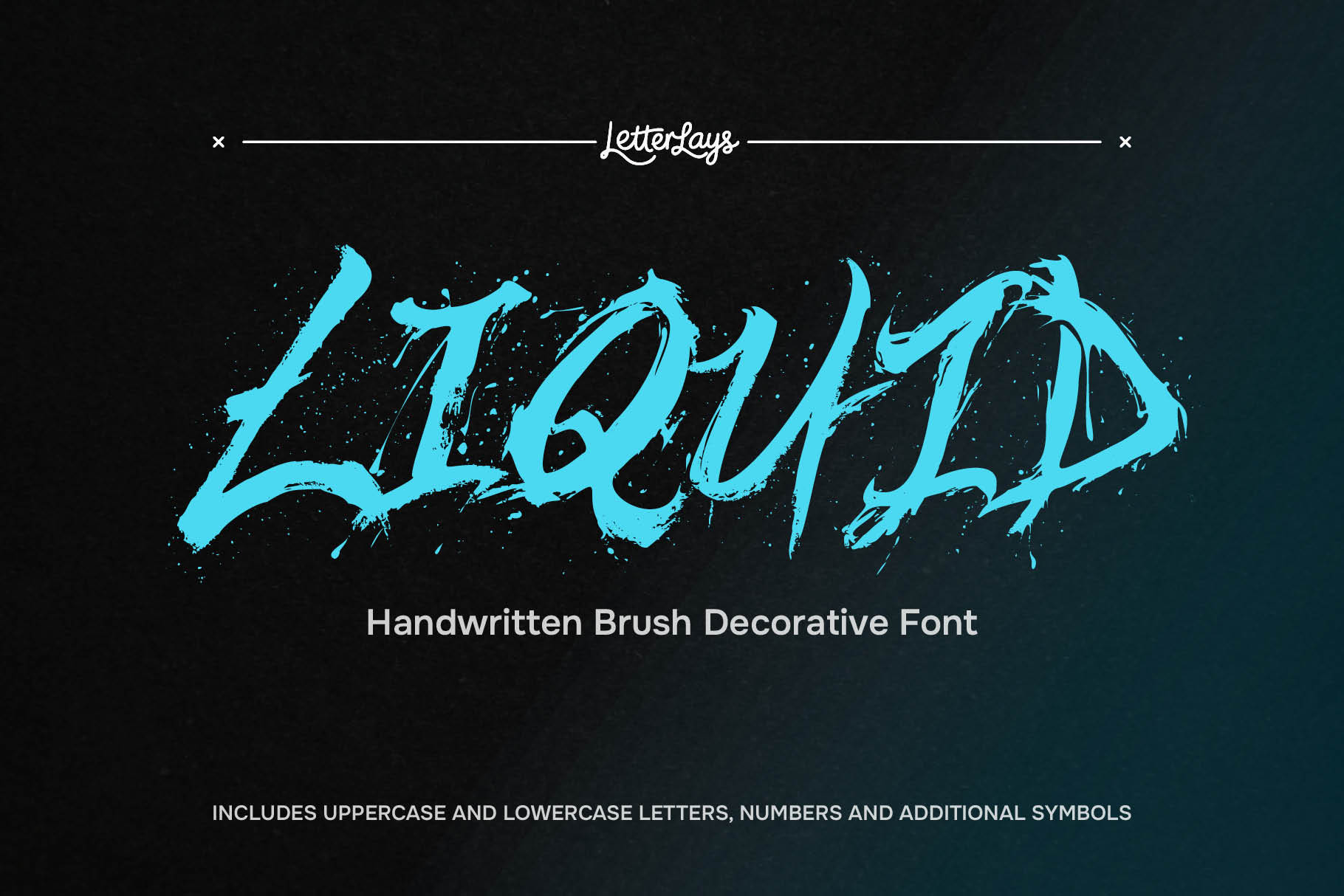
Psychedelic and dripping typography commands an enduring presence in visual culture. Originating in 1960s concert handbills by Wes Wilson, Victor Moscoso, and Bonnie MacLean, fluid lettering continually reinvents itself across generations. From the neon-drenched rave flyers of 1990s club culture and Y2K cyber-surrealism to modern festival branding, streetwear graphics, craft beer cans, and electronic music album packaging, melting letterforms communicate visceral energy, altered perception, and expressive freedom. Liquid letterforms reject rigid utilitarian grids, transforming written words into dynamic, living sculpture.
However, liquid and dripping fonts present a formidable design challenge: the fine line between expressive art and visual illegibility. On sterile white specimen pages, melting stems, oozing serifs, and gravitational drips look captivating. Yet event posters rarely live in isolated environments. They are printed on textured paper stock, overlaid on complex crowd photography, placed across high-contrast concert lighting, or shared as fast-moving thumbnails on social media feeds. If a liquid typeface is deployed without testing its optical balance against actual background artwork, its fluid contours can collapse into an unreadable smear. To craft a successful poster, designers must understand how fluid typography behaves in real photographic contexts.
The Letterlays catalog features a curated collection of distinct liquid, melting, and psychedelic display typefaces, each engineered for specific emotional registers and visual intensities: - [Liquid](/fonts/liquid): The flagship fluid display typeface on Letterlays. Built with heavy, swollen letterforms that evoke molten chrome, poured wax, or flowing mercury, Liquid delivers immense optical weight. Its bold silhouette anchors energetic rock concert posters and streetwear graphics, maintaining legibility even when layered over complex photographic textures. - [Melted Plasma](/fonts/melted-plasma): Extreme psychedelic fluid distortion characterized by dramatic downward drips and gravitational pooling. Melted Plasma captures the intense energy of acid techno raves, underground club nights, and dystopian sci-fi themes. Its elongated dripping terminals draw the viewer's gaze downward, creating dynamic vertical rhythm across tall poster formats. - [Fluidia](/fonts/fluidia): An organic, undulating display face that balances experimental fluidity with disciplined structural elegance. Unlike chaotic graffiti drips, Fluidia flows with a rhythmic, wave-like cadence. This makes it an exceptional choice for indie music festival lineups, contemporary gallery announcements, and artisanal beverage packaging where fluid beauty must accompany clear communication. - [Liquid Flame](/fonts/liquid-flame): Combustion meets fluid dynamics. Liquid Flame combines rippling contours evoking heat waves with dripping terminals, honoring 1960s rock handbills with modern OpenType precision at billboard scale. - [Dripmallow](/fonts/dripmallow): A playful, puffy melting typeface that merges the soft volume of marshmallow confections with street-art melting drips. Categorized under Playful & Bubbly, Dripmallow offers a friendly, highly approachable aesthetic ideal for pop-culture festivals, creative food packaging, and youthful streetwear drops. - [Inkadelic](/fonts/inkadelic): Intricate countercultural typography inspired by marbled ink suspensions, concert screenprints, and underground comix. Its swirling, hypnotic letterforms evoke kaleidoscopic visual depth, making it a natural fit for vinyl album covers, vintage merchandise, and artistic event posters. - [Glasswave](/fonts/glasswave): Fluid optical wave distortion capturing the refractive bends of submerged lettering and molten art glass. Perfect for cinematic, atmospheric event graphics and experimental editorial layouts. - [Synesthesia](/fonts/synesthesia): Surrealist melting typography designed to evoke multi-sensory cross-pollination. Its liquid letterforms twist in unexpected directions, creating an enigmatic visual hook for avant-garde cultural events and experimental music releases.
The secret to deploying dripping and psychedelic fonts without sacrificing clarity lies in disciplined typographic hierarchy. A common beginner mistake is setting every piece of poster information in an expressive fluid face. Setting dates and ticket details in dripping letters creates visual exhaustion. High-impact poster design relies on three clear structural tiers: 1. Level 1 (The Hook): Set the band name, event title, or festival headliner in an expressive liquid face like [Liquid](/fonts/liquid) or [Melted Plasma](/fonts/melted-plasma). This acts as the emotional anchor that catches the viewer's eye from across the street or in a crowded social feed. 2. Level 2 (The Sub-Anchor): Set supporting acts or event themes in a contrasting, clean geometric display face or condensed sans-serif to provide structural contrast without competing for attention. 3. Level 3 (The Details): Set functional information (date, doors open, venue location, ticket URLs, age restrictions) in a rock-solid, highly legible grotesque or neutral sans-serif with generous tracking and clean leading. This ensures that once the liquid headline captures attention, the practical details are effortlessly readable.
Testing liquid letterforms in the browser before purchasing is essential via Letterlays Studio at letterlays.com/studio: 1. Choose your canvas: Open Studio and set your poster dimensions, whether standard print ratios (A4, A3) or vertical digital formats (1080x1350 for Instagram feeds). 2. Upload your artwork: Upload your actual concert photograph, background illustration, or textured poster backdrop directly into the editor. 3. Type your real headline: Enter the exact band name or event title rather than generic placeholder copy. This reveals immediately how specific letter combinations, descender drips, and ascenders interact. 4. Fine-tune tracking and scale: Use Studio's live sliders to calibrate font size, letter spacing, and line height. Liquid fonts benefit from slightly expanded tracking to give dripping terminals optical breathing room and prevent adjacent letters from colliding. 5. Evaluate contrast and legibility: Toggle colors and test letter placement across light and dark areas of your photo. If the background image is visually noisy, reposition the text into calmer negative space or sample an accent color directly from the image. 6. Export high-resolution proofs: Export crisp PNG, JPG, or PDF mockups to inspect on mobile screens or print as physical proofs before committing budget to a commercial licence.
Letterlays operates on a straightforward, creator-first licensing model with zero recurring monthly subscriptions: - Desktop / Creator Licence ($12): Covers desktop installation on up to two workstations, unlimited commercial poster designs, client work, branding, logos, and physical merchandise (t-shirts, art prints, tote bags) where the lettering is delivered as rasterized artwork or outlined vectors. - Webfont Licence ($29): Includes full Desktop rights plus self-hosted webfont embedding on one domain up to 100,000 monthly pageviews. - Business Licence ($49): Bundles 3 desktop seats, webfont embedding, and a digital publication title for small businesses using a single font across multiple collateral pieces. - App & Game Licence ($99): Embeds the font software inside one mobile app, desktop application, or video game up to 25,000 monthly active users. Free demo versions of Letterlays typefaces are also available on reputable font directories (such as BeFonts and FontSpace). These free demos include capital letters A to Z, numbers 0 to 9, and core punctuation for personal evaluation. When you are ready for commercial production, upgrading to the full $12 commercial licence on letterlays.com unlocks lowercase characters, extended punctuation, accent marks, and commercial legal clearance.
Comparing Letterlays liquid and psychedelic typefaces highlights their distinct aesthetic roles:
| Typeface | Slug & Link | Visual Mood | Drip & Liquid Intensity | Optimal Poster Genre | Licence Starting Price |
|---|---|---|---|---|---|
| Liquid | [Liquid](/fonts/liquid) | Heavy, molten, oozing | High (dense fluid weight) | Rock concerts, streetwear, festival headers | $12 Desktop |
| Melted Plasma | [Melted Plasma](/fonts/melted-plasma) | Trippy, gravitational drips | Extreme (vertical drips) | Rave flyers, acid techno, sci-fi horror | $12 Desktop |
| Fluidia | [Fluidia](/fonts/fluidia) | Elegant, rhythmic, undulating | Moderate (wave cadence) | Indie festivals, gallery exhibitions, beverages | $12 Desktop |
| Liquid Flame | [Liquid Flame](/fonts/liquid-flame) | Fiery, rippling, psychedelic | Moderate to High (flaring ripples) | Retro rock revivals, psychedelic handbills | $12 Desktop |
| Dripmallow | [Dripmallow](/fonts/dripmallow) | Playful, puffy, sweet | Moderate (rounded drips) | Pop festivals, candy packaging, club events | $12 Desktop |
| Inkadelic | [Inkadelic](/fonts/inkadelic) | Marbled ink, hypnotic | Moderate (swirling curves) | Vinyl album jackets, craft art posters | $12 Desktop |
| Glasswave | [Glasswave](/fonts/glasswave) | Refractive, aquatic glass | Moderate (wave distortion) | Dreamlike art posters, cinematic flyers | $12 Desktop |
| Synesthesia | [Synesthesia](/fonts/synesthesia) | Surrealist, multi-sensory | High (organic bending) | Avant-garde performances, art cinema | $12 Desktop |
To make liquid typography vibrate with energy on a poster, pair it with intentional color strategies. Acid neons (such as chartreuse green, electric cyan, and hot magenta) stand out with electric intensity when set against deep charcoal, midnight purple, or desaturated photography. For vintage 1960s psychedelic aesthetics, explore warm split-tones: pairing ochre yellow with burnt orange and deep plum. If your poster background is photographic, consider sampling a dominant highlight color from the image for the main letterforms, then adding a subtle contrasting stroke or soft ambient glow to cleanly separate dripping contours from the background texture.
Dripping and psychedelic typography is not merely decorative ornamentation; it is an emotional statement. By pairing expressive liquid headlines with disciplined supporting text, verifying optical contrast over your photography in Letterlays Studio, and securing a perpetual commercial licence from $12, you can create posters that capture attention, communicate clearly, and leave an indelible visual impression.
Frequently asked questions
How do I keep a dripping psychedelic font legible on a busy concert poster?
Maintain strict typographic hierarchy: use the dripping font only for the primary headline (1 to 4 words), and set all dates, venues, and ticket details in a clean, high-legibility sans-serif. In addition, give dripping letters slightly wider tracking so their fluid terminals do not bleed into neighboring glyphs, and place the headline in a calm area of the background photography.
Can I test my own poster artwork with these fonts before buying a licence?
Yes. You can open letterlays.com/studio in your web browser, upload your poster photo or illustration, and test all liquid and psychedelic fonts instantly for free. Studio lets you adjust font size, letter spacing, line height, and color in real time, and export test mockups before making a purchase.
What secondary fonts pair best with heavy liquid display headlines?
Pair heavy liquid headlines with neutral, highly readable typefaces: clean grotesque sans-serifs, geometric sans-serifs, or functional monospaced fonts. The contrast between fluid, melting display curves and rigid, utilitarian information type creates balanced visual harmony and effortless readability.
Does a $12 Desktop licence cover posters printed and sold as commercial merchandise?
Yes. The Letterlays Desktop / Creator licence ($12) covers unlimited commercial projects, including physical posters, screen-printed merchandise, t-shirts, album covers, and client deliverables, provided the lettering is supplied as rasterized artwork or outlined vector graphics rather than redistributing the raw font software.
What is the difference between Letterlays free demo fonts and the full commercial versions?
Free demo fonts (available on directories like BeFonts and FontSpace) include uppercase letters A to Z, numbers 0 to 9, and basic punctuation for personal evaluation only. Purchasing the full commercial font ($12 Desktop) unlocks lowercase letters a to z, extended punctuation, accent marks, and commercial legal clearance.