12 lettering directions to explore in 2026
A visual prompt list for choosing a direction — from quiet editorial serifs to raw street marks — without chasing a single trend.
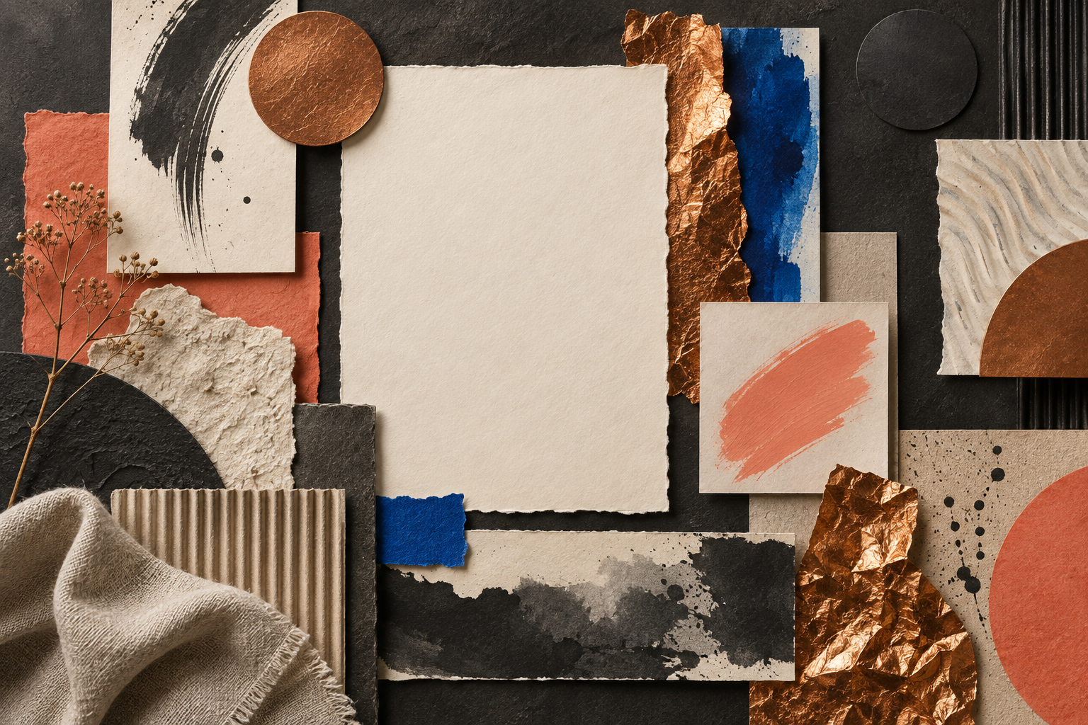
Use this list as a set of prompts, not a checklist of trends. A strong lettering direction gives you a starting constraint; the final design still comes from the subject, the image and the audience.
1. Quiet editorial serif — high contrast, generous spacing and a calm, considered voice. 2. Soft handwritten — irregular rhythm and a human touch for invitations, packaging and personal brands. 3. Chalk and craft — tactile edges that feel made rather than rendered.
4. Raw street mark — compressed, energetic shapes for posters and music-led work. 5. Liquid display — inflated curves and fluid silhouettes for a more playful, surreal mood. 6. Monoline minimal — one consistent stroke for clear symbols, labels and restrained layouts.
7. Sharp gothic — pointed terminals and strong verticals that create drama without needing extra effects. 8. Retro groove — rounded rhythm, generous counters and a colour palette that can carry nostalgia. 9. Dry brush — visible gesture and speed for expressive headlines.
10. Playful bubble — soft forms that work best when the message can be friendly and direct. 11. Geometric bold — simple construction with enough mass for thumbnails and signage. 12. Mystic decorative — ornamental detail for worlds that need atmosphere, used sparingly so the message remains legible.
Pick one direction, then make three tests: a short headline, a longer phrase and a single-word mark. If the style only works in one of the three, treat it as an accent rather than the main voice. The Letterlays catalogue is organised by these kinds of behaviour so you can compare a family quickly in the Studio.